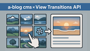
a-blog cms のグループユニットで Swiper を利用できる実装方法について

はじめに
以前、PhotoCollage.js を a-blog cms のブログテーマに実装する記事を書きました。
「グループユニットにクラスを付けるだけで、中の画像をいい感じに変換する」という実装方針だったのですが、先日 まったく同じやり方で Swiper のスライダーを実装してほしい、と Claude Code にお願いしてみたところ、ほぼ 5 分で動くところまで終わってしまいました。
正直、解説記事を書くまでもない気もするのですが、「次に同じことをやるとき」や「人に頼むとき」に “この記事と同じ方式で Swiper を” と言えば済むように、やったことを書き残しておきます。
何ができるようになるか
編集画面でグループユニットのクラスに
js-swiperを指定するだけそのグループ内に入れた画像が、自動で Swiper のスライダーになる
機能:ページネーション(ドット)/前後ナビ矢印/ループ/オートプレイ
おまけで 再生・停止ボタン(自動再生の一時停止 UI)も追加
PhotoCollage と同じく「マークアップを JS で組み替える」方式なので、テンプレート側の編集は最小限です。
実装の全体像
.js-swiper(グループユニット)
  └─ a-blog cms が出力する画像(column-media > img)   ← JS で収集
        ↓ 必要な構造に組み替え
  .swiper > .swiper-wrapper > .swiper-slide × N
        (+ pagination / navigation / 再生停止ボタン)
        ↓
  new Swiper(...) で初期化
やることは 3 つだけです。
テーマの
headに Swiper(CDN)と自前の init / CSS を読み込むjs-swiperを Swiper に変換する init スクリプトを置く管理画面でグループユニットのクラスに
js-swiperを設定する
1. テーマへの読み込み
<link rel="stylesheet" href="https://cdn.jsdelivr.net/npm/swiper@11/swiper-bundle.min.css">
<link rel="stylesheet" href="/css/swiper-custom.css">

<script src="https://cdn.jsdelivr.net/npm/swiper@11/swiper-bundle.min.js"></script>
<script src="/js/swiper-init.js"></script>
2. 初期化スクリプト(/js/swiper-init.js)
js-swiper の中の画像を集めて、Swiper の構造に組み替えてから初期化します。 PhotoCollage で学んだ 「画像が 0 枚なら中身を壊さない」安全策や、alt の引き継ぎもそのまま入れています。
/**
 * Swiper 初期化
 * グループユニットのクラスに「js-swiper」を指定した箇所を、
 * グループ内の画像から Swiper スライダーに組み替えて初期化する。
 * 機能: ページネーション(ドット) / 前後ナビ矢印 / ループ / オートプレイ
 */
document.addEventListener("DOMContentLoaded", function () {
  if (typeof Swiper === "undefined") {
    return;
  }

  var groups = document.getElementsByClassName("js-swiper");

  Array.prototype.forEach.call(groups, function (group) {
    // グループ内の画像を収集
    var imgs = group.querySelectorAll("img");

    // 画像が1枚も無い場合は何もしない(元の内容を壊さない安全策)
    if (imgs.length === 0) {
      return;
    }
    // すでに初期化済みなら二重処理しない
    if (group.querySelector(".swiper")) {
      return;
    }

    // Swiper が要求する構造を生成
    var swiperEl = document.createElement("div");
    swiperEl.className = "swiper";
    var wrapperEl = document.createElement("div");
    wrapperEl.className = "swiper-wrapper";

    Array.prototype.forEach.call(imgs, function (img) {
      var slideEl = document.createElement("div");
      slideEl.className = "swiper-slide";
      var newImg = document.createElement("img");
      newImg.setAttribute("src", img.getAttribute("src") || "");
      var alt = img.getAttribute("alt");
      if (alt) {
        newImg.setAttribute("alt", alt); // alt を引き継ぐ
      }
      newImg.setAttribute("loading", "lazy");
      slideEl.appendChild(newImg);
      wrapperEl.appendChild(slideEl);
    });
    swiperEl.appendChild(wrapperEl);

    // ページネーション(ドット)
    var paginationEl = document.createElement("div");
    paginationEl.className = "swiper-pagination";
    swiperEl.appendChild(paginationEl);

    // 前後ナビ矢印
    var prevEl = document.createElement("div");
    prevEl.className = "swiper-button-prev";
    var nextEl = document.createElement("div");
    nextEl.className = "swiper-button-next";
    swiperEl.appendChild(prevEl);
    swiperEl.appendChild(nextEl);

    // グループの中身を Swiper 構造に差し替え
    group.textContent = "";
    group.appendChild(swiperEl);

    // 初期化
    var swiper = new Swiper(swiperEl, {
      loop: true,
      slidesPerView: 1,
      spaceBetween: 0,
      autoplay: {
        delay: 3000,
        pauseOnMouseEnter: true,
        disableOnInteraction: false,
      },
      pagination: { el: paginationEl, clickable: true },
      navigation: { nextEl: nextEl, prevEl: prevEl },
    });

    // --- 再生/停止トグルボタン(自動再生の一時停止 UI) ---
    var SVG_NS = "http://www.w3.org/2000/svg";
    var makeIcon = function (children) {
      var svg = document.createElementNS(SVG_NS, "svg");
      svg.setAttribute("viewBox", "0 0 24 24");
      svg.setAttribute("width", "18");
      svg.setAttribute("height", "18");
      svg.setAttribute("aria-hidden", "true");
      children.forEach(function (c) {
        var el = document.createElementNS(SVG_NS, c.tag);
        Object.keys(c.attrs).forEach(function (k) { el.setAttribute(k, c.attrs[k]); });
        svg.appendChild(el);
      });
      return svg;
    };
    var iconPause = makeIcon([
      { tag: "rect", attrs: { x: "6", y: "5", width: "4", height: "14" } },
      { tag: "rect", attrs: { x: "14", y: "5", width: "4", height: "14" } },
    ]);
    var iconPlay = makeIcon([
      { tag: "path", attrs: { d: "M8 5v14l11-7z" } },
    ]);

    var toggleBtn = document.createElement("button");
    toggleBtn.type = "button";
    toggleBtn.className = "swiper-autoplay-toggle";

    var renderToggle = function () {
      var running = !!(swiper.autoplay && swiper.autoplay.running);
      while (toggleBtn.firstChild) { toggleBtn.removeChild(toggleBtn.firstChild); }
      toggleBtn.appendChild(running ? iconPause : iconPlay);
      toggleBtn.setAttribute("aria-label", running ? "スライドショーを一時停止" : "スライドショーを再生");
      toggleBtn.setAttribute("aria-pressed", running ? "false" : "true");
    };

    toggleBtn.addEventListener("click", function () {
      if (!swiper.autoplay) { return; }
      if (swiper.autoplay.running) { swiper.autoplay.stop(); }
      else { swiper.autoplay.start(); }
      renderToggle();
    });

    swiper.on("autoplayStart", renderToggle);
    swiper.on("autoplayStop", renderToggle);

    swiperEl.appendChild(toggleBtn);
    renderToggle();
  });
});
3. CSS(/css/swiper-custom.css)
Swiper 本体の CSS に最低限の調整を足します。
/* 次の要素との間隔 */
.js-swiper {
  margin-bottom: 32px;
}

.js-swiper .swiper {
  width: 100%;
  /* ドット・矢印の色を白に(既定の青の主張を抑える) */
  --swiper-theme-color: #fff;
  --swiper-pagination-bullet-inactive-color: #fff;
}

/* 高さが異なるスライドがあるとき、低いスライドを縦中央に配置 */
.js-swiper .swiper-wrapper {
  align-items: center;
}

/* スライド画像をスライド幅にフィット */
.js-swiper .swiper-slide img {
  display: block;
  width: 100%;
  height: auto;
}

/* オートプレイ 再生/停止トグルボタン(白アイコン・右下配置) */
.js-swiper .swiper-autoplay-toggle {
  position: absolute;
  right: 12px;
  bottom: 8px;
  z-index: 11;
  width: 32px;
  height: 32px;
  display: inline-flex;
  align-items: center;
  justify-content: center;
  padding: 0;
  border: 0;
  border-radius: 50%;
  background: rgba(255, 255, 255, 0.4); /* 白の半透明で UI を統一 */
  color: #fff;
  cursor: pointer;
  line-height: 0;
}
.js-swiper .swiper-autoplay-toggle svg { fill: currentColor; }
.js-swiper .swiper-autoplay-toggle:hover { background: rgba(255, 255, 255, 0.6); }
.js-swiper .swiper-autoplay-toggle:focus-visible { outline: 2px solid #fff; outline-offset: 2px; }
ポイント:
色:Swiper はテーマ色を CSS 変数(既定の青
#007aff)で持っているので--swiper-theme-colorを#fffにするだけでドット・矢印が白になります。高さ違い:Swiper は全スライドの高さを自動では揃えません
.swiper-wrapper(flex)にalign-items: centerを付けると、低いスライドが行の中で**縦中央**に収まります.swiper-slide側ではなく wrapper 側がポイント)。下マージン
.js-swiperにmargin-bottomを付けるだけ。
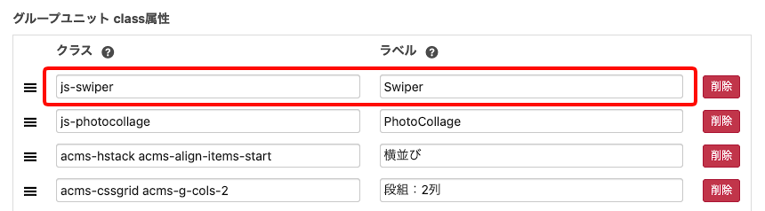
4. 管理画面の設定
「編集画面」メニューの「編集設定」から「グループユニット class属性」を設定します。
グループユニットの クラス:
js-swiperラベル:
swiper(任意)
投稿時にこのユニットグループを選び、中に画像を並べるだけ。
まとめ
PhotoCollage とまったく同じ「グループユニット+クラス指定+JS変換」方式で Swiper が実装できました。
しかも AI に「PhotoCollage と同じ方式で Swiper を」と頼んだら5 分。
同じ要領で、ライトボックスや別のスライダーライブラリにも応用できそうです。
というわけで、今後はこの記事を指して「これと同じ方式で◯◯を」と言えば済む、という備忘録でした。