a-blog cms と View Transitions API で作るページ遷移のアニメーションの実装について
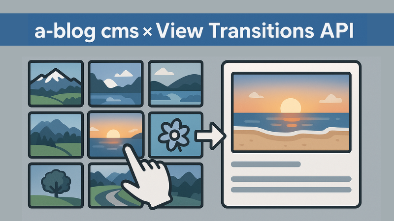
View Transitions API の利用することで、一覧ページの Entry_Summary から詳細ページの Entry_Body にページを遷移する際に、画像が拡大するようなアニメーションをつけることができます。実際の動きは、以下の YouTube の動画をご覧ください。
View Transitions API の Style を設定する
以下の3つのファイルを作って、ご利用の Summary と Body に組み込むだけの簡単に実装することができます。個別のファイルにしておくことで、他でもいろいろ活用できるのでオススメです。
- /include/head/transition-utid.html
- /include/entry/transition-utid-summary.html
- /include/entry/transition-utid-body.html
/include/head/transition-utid.html
これは <head> タグ内にインクルードしてください。
<style>
@view-transition {
    navigation: auto;
}
<!-- GET_Rendered id="transition-utid" -->
</style>
GET_Rendered を書くことで、この後に書いている2つのモジュールで書いた CSS を SetRendered で移動してくるイメージです。
/include/entry/transition-utid-summary.html
Entry_Summary の <!-- END unit:loop --> の下にインクルードしてください。
<!-- BEGIN_SetRendered id="transition-utid" -->
<!-- BEGIN unit:loop --><!-- BEGIN entry:loop -->
.unit-id-{utid} {
  view-transition-name: transition-utid-{utid};
  contain: paint;
}
<!-- END entry:loop --><!-- END unit:loop -->
<!-- END_SetRendered -->
/include/entry/transition-utid-body.html
Entry_Body の <!-- END entry:loop --> の上にインクルードしてください。
<!-- BEGIN_SetRendered id="transition-utid" -->
<!-- BEGIN mainImage -->
.unit-id-{utid} {
  view-transition-name: transition-utid-{utid};
  contain: paint;
}
<!-- END mainImage -->
<!-- END_SetRendered -->
View Transitions API で利用する Class を設定する
一覧の画像と詳細の画像が同じものだという設定 <style> で行なっているわけなので、あとは <img> に .unit-id-{utid} のような Class を設定します。
Entry_Summary の例
<img class="unit-id-{utid}" src="%{ROOT_DIR}{path}[resizeImg({x}, {y})]" alt="{alt}" width="{x}" height="{y}">Entry_Body のメディアユニット・画像ユニット
最近のバージョンの unit.html には、仕込みが済んでおり最初から設定済みではありますが、標準的に用意されている画像の遅延読み込みのアニメーションがあると逆効果になってしまいます。
元の <img> タグ
<img
  class="js-lazy-load columnImage unit-id-{image_utid}"
  data-src="%{HTTP_ROOT}{path}[resizeImg({resizeWidth})]"
  width="{x}"
  height="{y}"
  alt="{alt}"
>
そのため今回は class から js-lazy-load を外し、属性 data-src を src に変更します。
改良後の <img> タグ
<img
  class="columnImage unit-id-{image_utid}"
  src="%{HTTP_ROOT}{path}[resizeImg({resizeWidth})]"
  width="{x}"
  height="{y}"
  alt="{alt}"
>
これでカスタマイズは完了です。昨年秋までは Chrome と Edge で利用できる状態でしたが、秋から Safari でも動作するようになりました。これでスマホで OK になったこともあり、より活用できる範囲が広がっています。(残念ながら Firefox では未対応です)
この記事は、developer.a-blogcms.jp に公開しているコンテンツを正規版として扱うため、検索エンジンが正しい公開先を認識できるよう Canonical設定 および noindex設定 を適用しています。これにより、重複コンテンツとしてインデックスされることを防いでいます。
https://developer.a-blogcms.jp/blog/custom/ablogcms-viewTransitionsApi.html